The Pentair Inc. Annual Report is an advanced graphic representation of an Annual Report for a water treatment company. Several aspects of the book stick out as intriguing through its design.
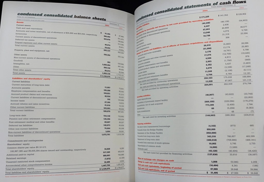
- Column usage: There is a consistent use of 2, 4, and 5-column pages. 2-column layouts are used on page layouts that feature analysis-based pages. 4 to 5-column pages are used in data table layouts to help represent significant amounts of data.
- Vibrant color palette: The designer chose to use a color palette of largely contrasting colors to help draw attention to specific information. There is a use of bright orange on the front and back cover. A contrasting dark Grey-Green throughout the interior, and a bright yellow to highlight important information.
- Typographic Leading: The way that the designer chose the typographic leading is intriguing. There is a mix of less leading in data-driven information and larger leading in analysis-driven typography.
- Typefaces: The designer chose to use a mix of Serif and Sans-Serif typefaces. This is a popular concept to alternate between primary and secondary typefaces to allow for a complimentary aspect of the typography throughout the design.
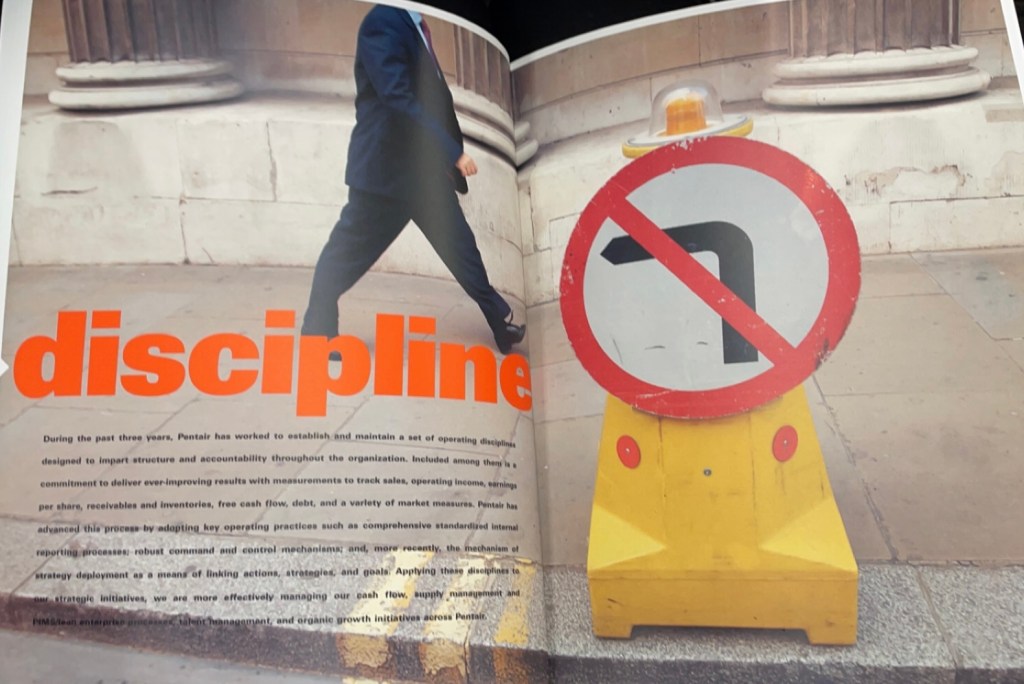
- Full Page Photographic Spreads: There are several full/multi-page photographic spreads featured throughout the design. These spreads were used to highlight specific words that were associated with Pentair. It is likely that these singular words are a part of their core beliefs/values.
- Headers: The typographic headers across the entire booklet showcase text that is solely lowercase. This design element is consistent throughout the booklet and are an interesting way of featuring specific typography information.
