Critique:
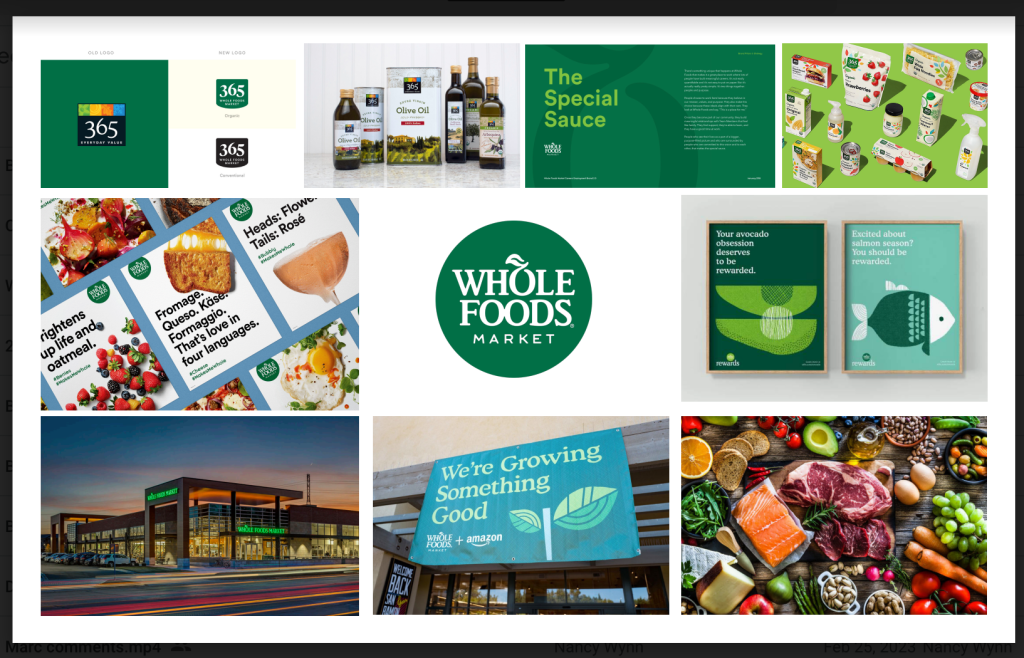
- I have completed the majority of the research for the project. I was extremely intrigued by the sub-brands within Whole Foods (e.g. 365). It was slightly difficult to understand the implementation of new branding and the timing of when that change occurred.
- I think that researching further, maybe going to a physical Whole Foods to see how the branding is implemented in real life, can help resolve some of the issues I had when researching.
- I have not outlined the copy text specifically, however, a lot of the research I have done will be almost directly transferred into the copy text for the guideline book.
- The Visual Branding Board is about done. I chose imagery that is a mix of Whole Foods advertising and natural food. Three words that describe Whole Foods’ branding are organic, natural, and simplistic. A great way that this is expressed in Whole Foods’ branding is through the use of a dark, natural green tone and simplistic designs that use a lot of negative space to its advantage.
- I have designed some thumbnail sketches, I think it will be crucial to keep the design simplistic and use a lot of negative space to correlate with the rest of their branding.

