Prior to the start of any project, I like to browse websites like Behance, Pinterest, and Dribbble in search of inspiration. Each one of these examples above represents an intriguing design element that I would like to influence in my own Brand Guideline Book for Whole Foods.
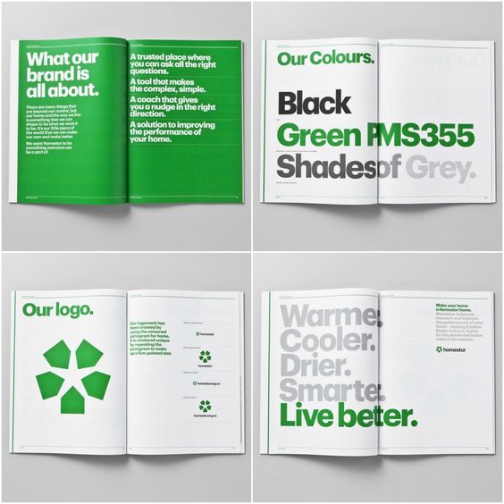
The first design is intriguing for its use of green as well as negative space. The design focuses on having elements take up large portions of the space. The stacked large typography is also a design technique I’m interested in adding to my book.
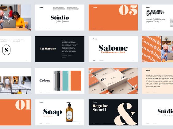
The second design utilizes serif fonts as a focal point for the majority of its page designs. The stark color contrasts and use of layout are interesting and quite uniform in their use.
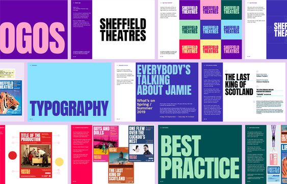
The third design is a more modern approach. With vibrant, high-contrast colors the design looks to use layout in a more dynamic approach. Similar to the first design, large typography is used as the focal point of the page designs.
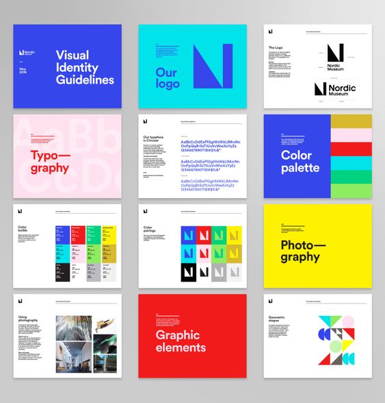
The final design is more traditional than the others in its layout design. A clean and consistent design with minimal change throughout. My one critique of this design is its title pages with the headers being broken into two lines.
