- Understanding the importance and significance behind the creation or development of something is often intriguing and fascinating. Like much of art, the grid is influenced by the history and culture that surrounds it. With the world coming out of time periods of great uncertainty and confusion, sparked the desire for structure. The industrial revolution and the emphasis on urbanization added to this idea of a grid. With its 90-degree angles, it was almost the perfect seemingly endless way to create structure and order through design.
- The Basel School was an interesting development in the world of art and design. The design methods heavily contributed to the International Style, with an emphasis on optical abstraction and the integration between typography and imagery. Often using stark contrast in light between the two mediums (A perfect example of this is seen below in “The New Swiss Film”, Figure 1).
- The importance of emphasis – Grid systems allow for a clear visual hierarchy to be established in a design. The mind perceives larger intervals of space or typographic weight as a sense of importance/hierarchy in the design. Visual shifts in grids help to create a conceptual sense of content. It is extremely interesting to think about the psychological factors that go into play not only in a grid system but any design.

Case Studies
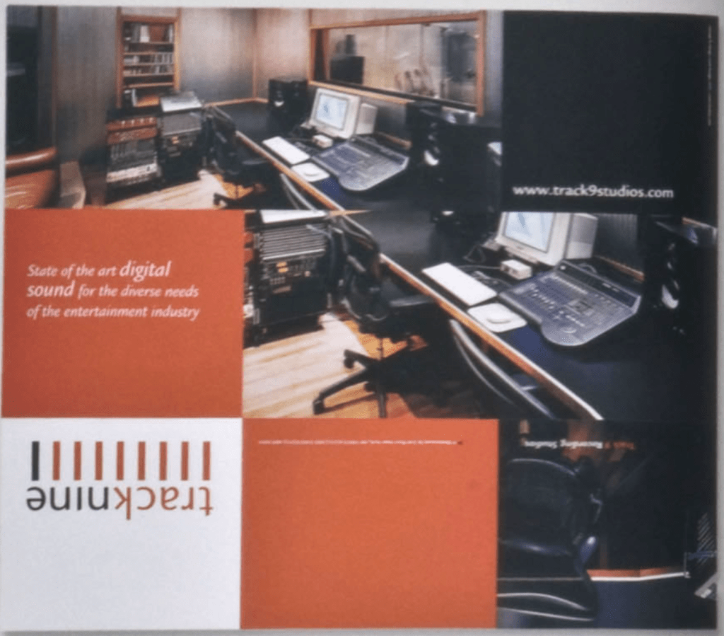
#9: The track nine brochure in example number nine is an interesting use of a modular grid. The square format helps to disperse pertinent information but also allows for clear division in the composition. Additionally, the simple sequence allows for an increase in information as the brochure is opened (See figure 2).
#12: Example number 12 features a compound grid that provides flexibility for the designer. As the layout plays out there is an alternation of 2 and 4-column grids. This adds intrigue and variability to the design layout (See figure 3).
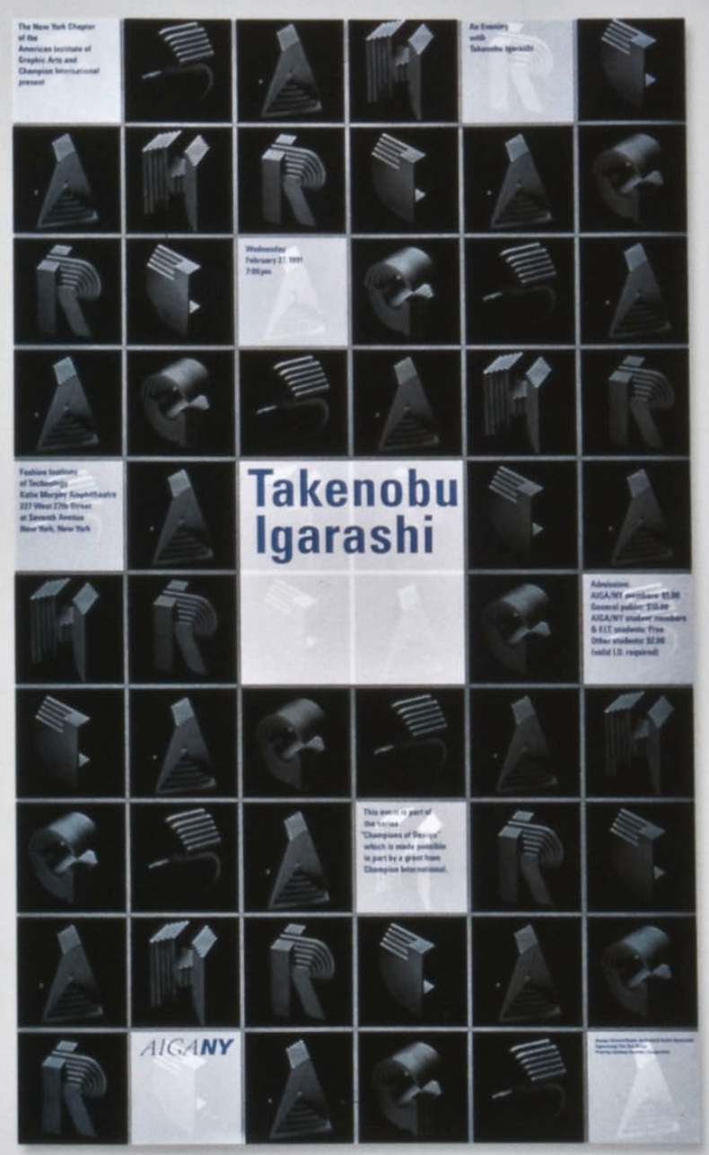
#19: The exhibition poster example #19 features a modular grid that is utilized to keep the design minimal. This is done by utilizing 3 columns cautiously to only display necessary information (See figure 4).
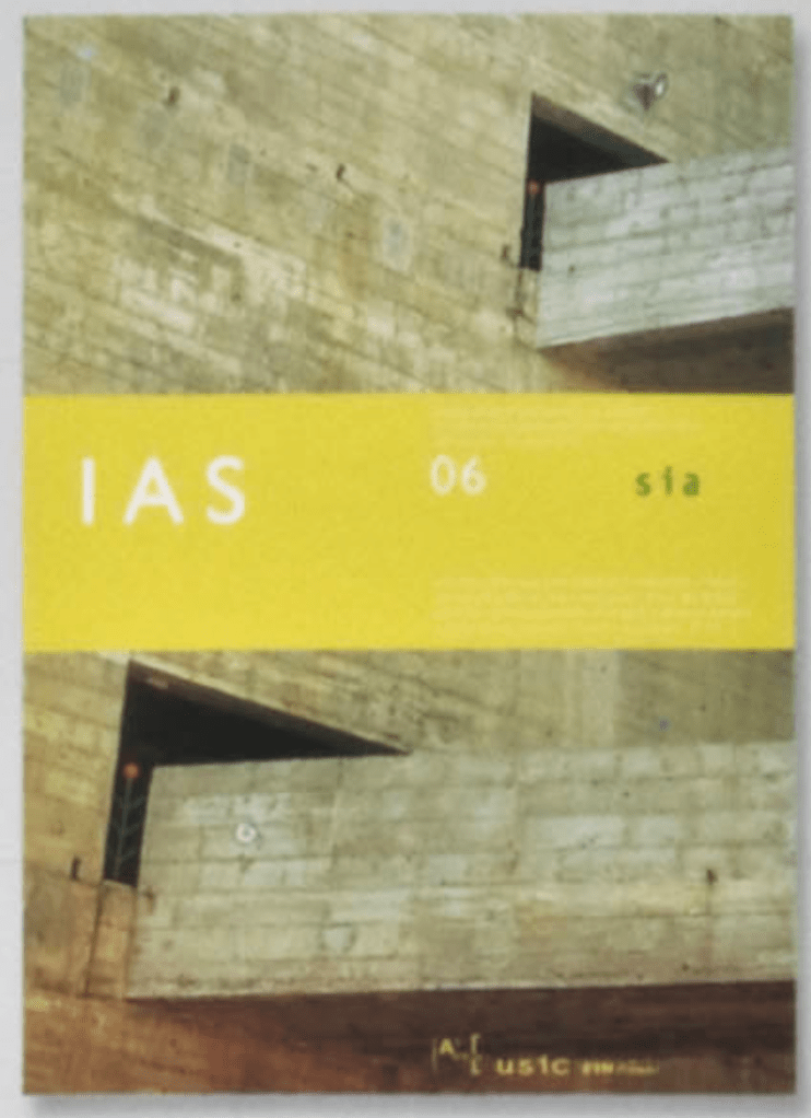
#23: The magazine cover example recognizes the need for division in separation with a hero image taking over the majority of the cover. The idea of a compositional system with a colored band that divides the design came to be the resulting design. This allows for consistency amongst designs with the ability to shift the band depending on the image in the background (See figure 5).