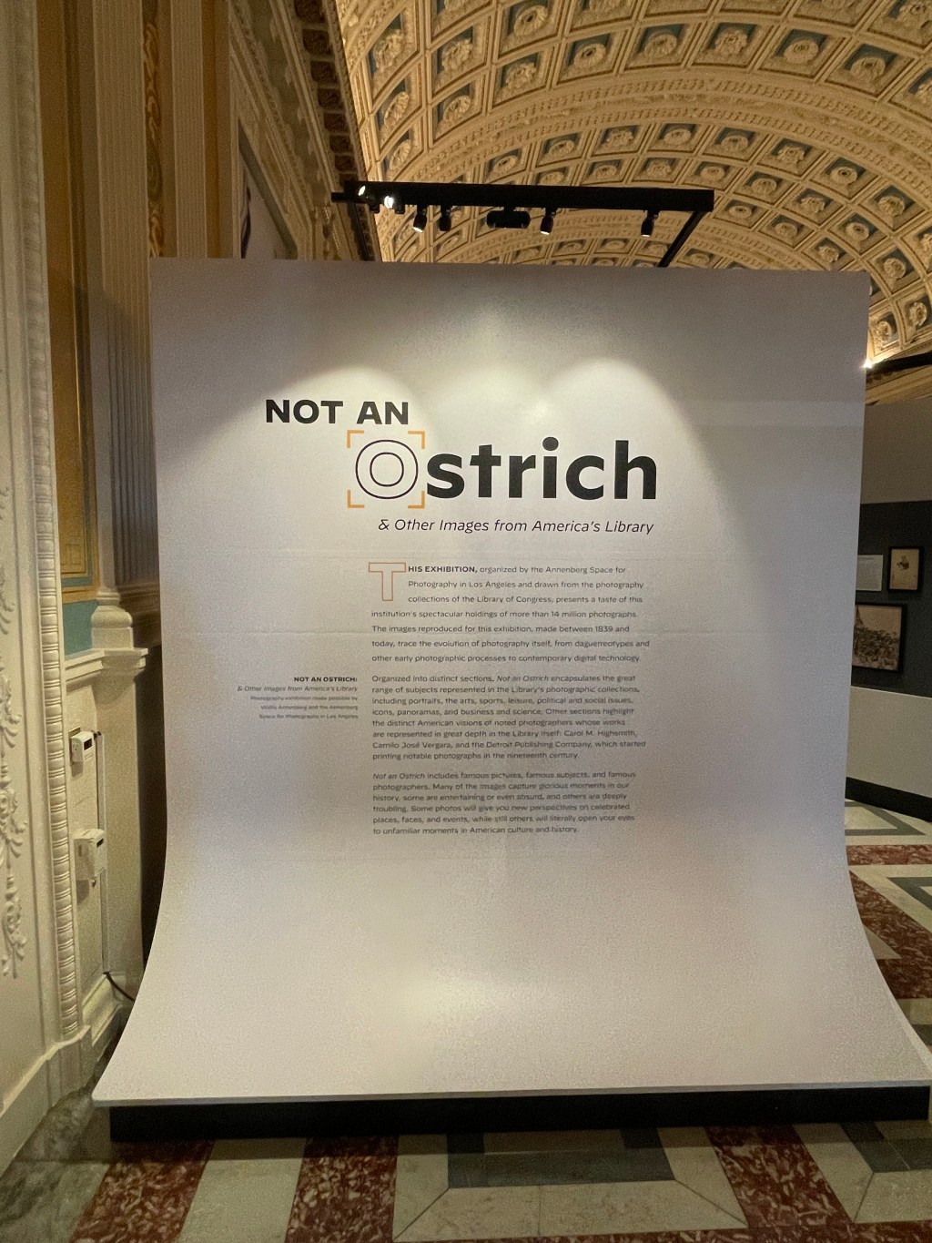

I recently had the pleasure of visiting the Library of Congress in Washington, D.C. Within the Library was an exhibit titled “Not an Ostrich”; featuring photography collections of the Library of Congress.
At the entrance of the exhibit was this banner-like design welcoming the patrons. The design as a whole is reminiscent of a backdrop for a photo shoot, nodding to the exhibition regarding examples of photography in history.
The information design itself displays great use of negative space and visual hierarchy. I personally love the addition of the “O” in ostrich appearing to be a camera or lens of sorts. The design is a creative and intriguing way of acknowledging what the exhibit is while being serious and playful.
