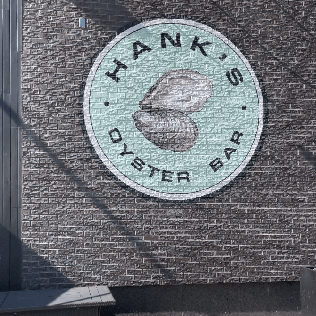
Identity design is fascinating in its ability to capture the essence of a brand in one simple image. An example of that I recently stumbled upon was Hank’s Oyster Bar in Washington, D.C.

A simple yet effective design is featured on one of the exterior walls of the restaurant. There are three aspects that I feel make this a perfect identity design:
- Color: The use of a teal color is effective in its ability to market water, freshness, and seafood. Before the guest even reaches the restaurant they are psychologically thought to believe that it is a seafood restaurant.
- Imagery: The emphasis on the oysters at the center of the identity design push forward the food served at the establishment. Additionally, the use of a more photographic image of oysters emphasizes freshness.
- Simplicity: The design is simple and modern as a unit and does not feature unnecessary elements that could distract a viewer from the message of the brand.
My one critique of the identity design is the visual hierarchy of the brand mark. The typography of hank’s and oyster bar is very similar as well as the imagery in the center. It is unclear what is supposed to be viewed first in the design and can be slightly confusing because of it.
