- “Meet Your Type: A Field Guide to Love & Typography” is a unique and fascinating book that combines the worlds of typography and romance. The author, two designers, provides an insightful and creative approach to understanding ourselves and our romantic preferences by using typography as a metaphor.
- The book is divided into sections that explore different aspects of typography and how they relate to our personalities and romantic preferences. For example, the chapter on Serif typefaces discusses the idea of tradition and stability, while the chapter on Script typefaces explores the concept of romance and sentimentality. The authors use these different typographic styles to help readers understand their own romantic preferences and how they relate to the types of people they are attracted to.
- What I appreciate most about this book is its unique approach to understanding ourselves and our romantic relationships. It’s a fun and engaging read that combines humor, design, and self-reflection.

Favorite Fonts from the Reading
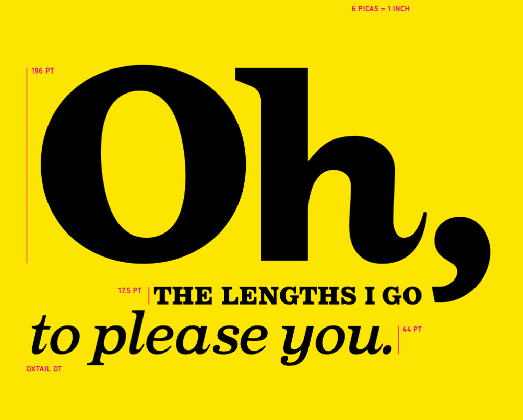
- Oxtail has a playful and whimsical feel. It is perfect for use in headlines, posters, and other large display settings, where its distinctive look can really stand out.
- Poster Bodoni is known for its elegant and refined look, with its thin, high-contrast strokes and sharp serifs that give it a sophisticated and timeless feel. Poster Bodoni is ideal for use in editorial design, book covers, and other high-end print applications.
