
015: Thou shall mix typeface choices to create typographic texture
Typographic texture is important to fundamental design for its ability to add depth and variability to one’s work. Slab serif typefaces often work more effectively as headlines, while a clean sans serif typeface works better for information-based content. It is important to recognize not only how these typefaces can complement each other but can add variability and visual hierarchy to a design layout.
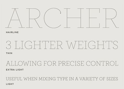
018: Thou shall not use ultra-thin typefaces for logo design
Similar to the previous rule it is important to understand how to use typefaces correctly, this rule focuses on typeface weight. Ultra-thin letterforms have become a way of expressing modernism and luxury in design, but how thin is too thin? It is important to recognize that a typeface that is too thin can become washed out in designs or entirely missed in relation to other typefaces used in a design. Additionally, a thin letterform used in a brandmark can become hard to read or invisible when scaled down in size.
