I am always intrigued by branding system design. Everywhere that I go, I am always looking at the way a brand identity is developed and how the different aspects work together in harmony.
The Good Ritual is a sustainable-focused coffee brand run entirely online. The specialty coffee brand, has developed an instant coffee that has all the benefits of regular coffee without the downsides. With premium ingredients and humane practices, the Good Ritual offers a unique experience to the daily coffee “ritual”.
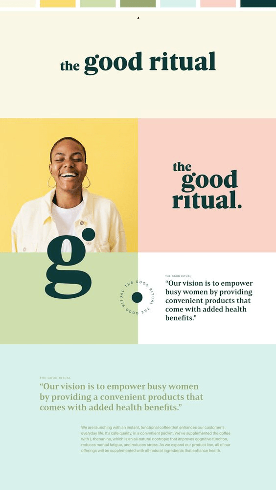
I feel that Good Ritual invested heavily in creating an effective brand identity system. Starting with the brandmark, featuring a heavy weighted serif typeface. The use of such a bold and strong wordmark emphasizes strength and stability in the company. The use of a serif typeface instead of a sans serif suggests that their brand is associated with luxury or top of the line quality. Additionally, the isolated “G” serves as a secondary isolated brandmark design. The top right circle in the G brandmark adds personality to the overall brandmark system.
The rest of the branding system uses a pastel color palette. Each color works well together and adds a happy and playful nature to the brand. Using natural colors yellows, greens, and blues adds to their focus on sustainability and the use of natural ingredients in their instant coffee.
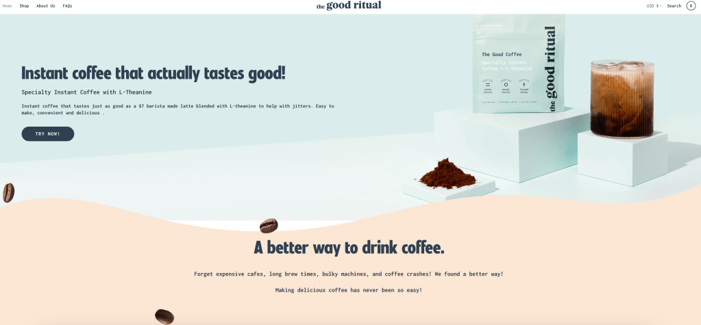
Their website design shares a similar playfulness through the use of large happy imagery and curvilinear lines throughout. Using playful language like “a better way to drink coffee” or “the good coffee” adds to their overall brand tone and voice.
