

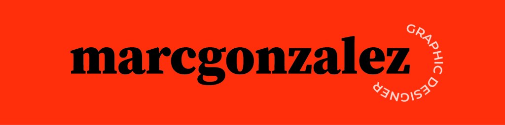

For the 3rd revision of the personal brandmark identity project I have moved forward with a prior design of the serif all lowercase “marcgonzalez”. The intention of this design is to focus on bold/confidence while still being inviting and friendly through the use of all lowercase type in the design. The addition of the “graphic designer” rounded at the end of the design encloses the brandmark and adds an additional variability of friendliness.
A secondary design pulls the “m” & “g” out of the full design and features it in a larger scale with a slight overlap. The intention of this secondary design is to highlight the beauty in the lowercase “g” from the serif typeface.
Lastly , I chose to use a bold orange/red and black color palette to emphasize confidence and vibrancy to contrast the more friendly wordmark design.
