Project Brief
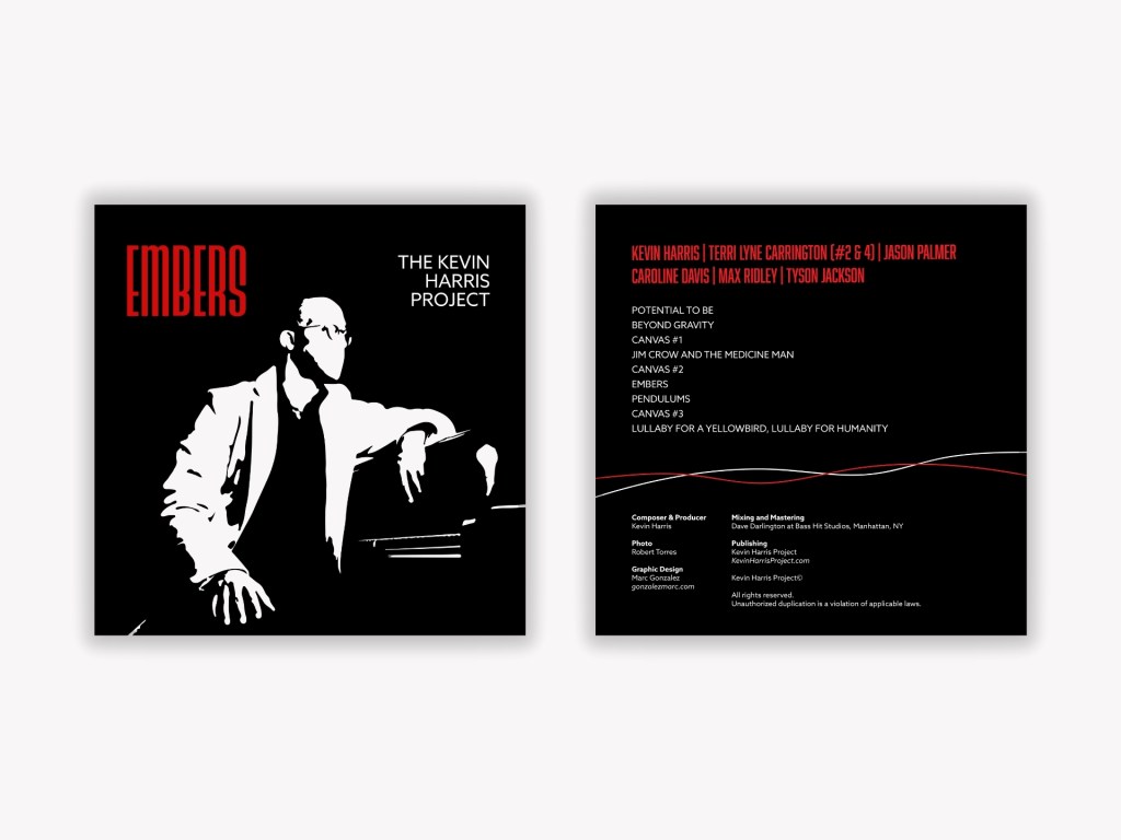
Embers is a visual exploration of jazz, identity, and artistic resilience. Designed for pianist and composer Kevin Harris, the album cover translates the project’s musical themes—power, introspection, and creative ignition—into a bold, graphic language. The goal was to craft a cover that feels timeless yet contemporary, honoring the lineage of classic jazz album art while giving it a sharp, modern edge.
The design embraces a stark black-and-white palette to emphasize contrast and emotional gravity, allowing the figure to emerge almost like a silhouette carved out by light. The use of negative space becomes a metaphor for possibility, reflection, and the quiet moments before inspiration sparks. The title “Embers” appears in a condensed, high-impact typeface, glowing in red against the monochromatic background to symbolize heat, creativity, and the lingering spark at the core of Harris’s music.
On the back cover, a minimalist layout organizes track listings and credits with precision. Subtle red and white lines sweep across the composition, echoing musical phrasing and rhythmic flow. This restrained visual motion complements the album’s tonal complexity without overpowering the content. Together, these elements create a visual identity that is strong, elegant, and deeply connected to the album’s conceptual roots—capturing a project that burns quietly but brightly, just like its name.
